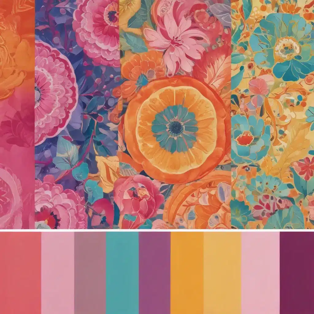
As an experienced art writer and creative consultant, I’ve seen firsthand how the thoughtful use of colour can elevate an artwork or design from good to great. We learned this the hard way… Colour harmony—the balanced and aesthetically pleasing interaction of hues—is a fundamental principle that every artist and designer should master. Whether you’re working in painting, drawing, digital art, or product design, understanding colour theory and its practical application can transform your creative process and the impact of your final work.
Now, this might seem counterintuitive…
Colour Theory Foundations
At the heart of colour harmony lies the colour wheel, a tool that visually organizes colours based on their relationship to one another. The primary colours—red, blue, and yellow—form the foundation, with secondary colours (green, orange, purple) created by mixing two primary hues. Tertiary colours arise from blending primary and secondary shades.
Each colour on the wheel also has distinct temperature properties, with yellows to reds being “warm” and blues to greens being “cool”. Strategically combining warm and cool tones is a key technique for creating vibrant, harmonious palettes.
Just as important as hue are the other colour properties of value (lightness/darkness) and saturation (intensity). Manipulating these elements allows designers to craft palettes that evoke specific moods, guide the viewer’s eye, and enhance usability.
Colour Harmony Schemes
When it comes to putting colour theory into practice, designers and artists rely on a variety of colour harmony schemes to build their palettes. Each scheme offers unique visual effects and emotional responses:
- Monochromatic: Using various tints, tones, and shades of a single hue. This creates a cohesive, minimalist look.
- Analogous: Pairing three adjacent colours on the colour wheel, like blue-green, green, and yellow-green. Analogous schemes have a harmonious, natural feel.
- Complementary: Combining two colours directly opposite each other, such as red and green or blue and orange. Complementary palettes generate high contrast and visual interest.
- Split-Complementary: A variation on complementary, using the two colours adjacent to the complement. This softens the contrast while still creating visual tension.
- Triadic: Selecting three evenly spaced hues, like red, blue, and yellow. Triadic schemes are vibrant yet harmonious.
- Tetradic: Combining two sets of complementary colours for a richer, more complex palette. Tetradic can be visually striking but requires careful balancing.
Mastering these colour harmony principles empowers artists and designers to craft palettes that captivate the viewer, convey a specific mood or message, and enhance the overall user experience.
Conceptual Colour Palettes
While colour harmony schemes provide a strong foundation, the most compelling palettes go beyond purely aesthetic considerations. By aligning colour choices with conceptual meaning, artists and designers can infuse their work with deeper layers of significance and emotional resonance.
For example, a wildlife artist might leverage blues and greens to evoke the peaceful, restorative qualities of nature. A product designer for a sustainable clothing brand could choose an earthy, organic colour scheme to reinforce the brand’s commitment to environmentalism. In both cases, the colours don’t just look good—they actively contribute to the overall narrative and purpose of the piece or design.
Considering the symbolic meanings and cultural associations of colours is also crucial. In Western culture, red often signifies passion, power, or danger, while blue evokes trust, calm, and professionalism. But these connections can vary greatly across different regions and communities. Thoroughly researching your target audience and their colour perceptions is essential for creating palettes that effectively communicate your intended message.
Beyond symbolism, paying attention to the emotional impact of colours is key. Warm hues like yellows and oranges tend to feel energetic and stimulating, while cool tones like blues and greens have a more serene, relaxing effect. Adjusting the saturation and value of colours can also dramatically shift their emotional resonance—a high-chroma, saturated red feels radically different from a muted, desaturated burgundy.
Practical Colour Palette Development
So, how do you go about developing a cohesive, conceptually-engaging colour palette? Here’s a step-by-step process I recommend:
-
Establish Your Creative Vision: Start by clearly defining the purpose, mood, and message you want to convey through your artwork or design. Consider the target audience, brand identity, and cultural context.
-
Research Colour Meanings: Dive into the symbolic, emotional, and cultural associations of different hues. Understand how colour temperature, saturation, and value impact the overall feel.
-
Experiment with Colour Harmony: Use the colour wheel to explore various harmony schemes. Test out complementary, analogous, and triadic combinations. Observe how the palettes make you feel and how they align with your creative vision.
-
Refine and Balance: Carefully adjust the saturation, value, and temperature of your chosen colours. double-check that a cohesive, harmonious feel while highlighting key elements through strategic use of contrasting or accent hues.
-
Validate and Iterate: Apply your palette to sketches, mockups, or prototypes. Gather feedback from peers, clients, or your target audience. Refine your choices based on the responses, testing different variations until you land on the perfect combination.
Harnessing the power of colour harmony and conceptual meaning is a transformative skill for any artist or designer. By mastering these principles, you can elevate your work to new heights, captivating viewers and conveying your creative vision with clarity and impact.
To learn more about colour theory and its practical applications, I recommend checking out these resources:
- Interaction Design Foundation’s deep dive into color theory
- ‘What Is Color?’ by Arielle Eckstut and Joann Eckstut
- Figma’s guide to building effective color combinations for UI design
And of course, keep exploring the wealth of artistic techniques, creative inspiration, and design tutorials available on Pencil and Paint Muse. Happy creating!
Example: Modern Abstract Painting Series 2024