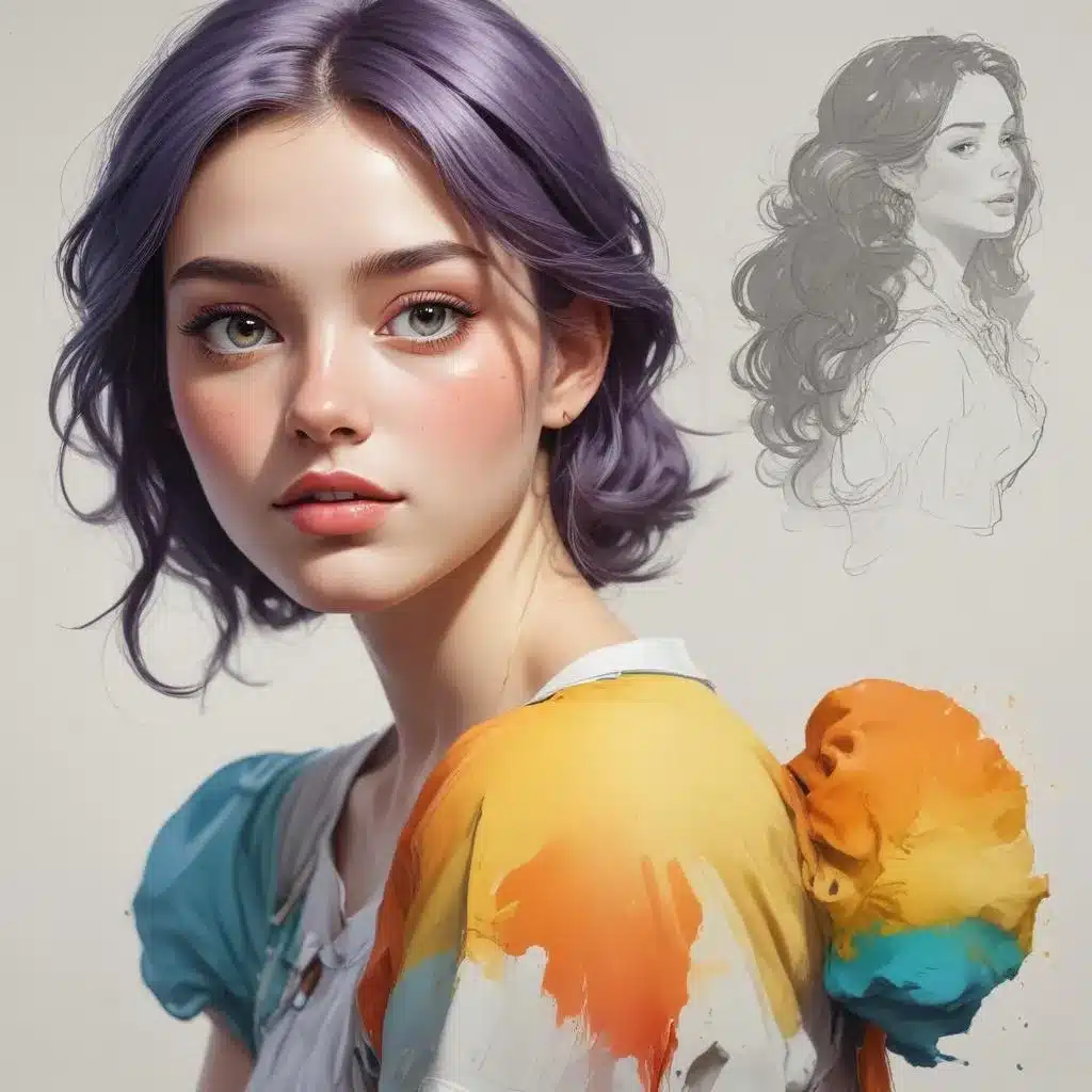
Character design is a dynamic and multifaceted art form that relies heavily on the thoughtful application of colour. Whether you’re crafting fantastical beings, dynamic heroes, or whimsical cartoon characters, understanding how to harmonise colour can elevate your designs from good to truly great.
Now, this might seem counterintuitive…
Laying the Groundwork: Colour Theory Essentials
Before we dive into the specifics of character colour harmonisation, let’s revisit some fundamental colour theory concepts. This will provide a solid foundation for making informed decisions about your character’s palette.
Colour Harmonies: At the heart of colour theory are the various colour harmonies – specific combinations of hues that create a sense of balance and cohesion. Some key harmonies include:
- Monochromatic: Using different tints, tones, and shades of a single hue.
- Analogous: Using colours that are adjacent on the colour wheel, like blue, blue-green, and green.
- Complementary: Using colours that are opposite on the colour wheel, like red and green or blue and orange.
- Triadic: Using three colours that are evenly spaced on the colour wheel, like red, yellow, and blue.
Understanding these basic harmonies will inform your character design choices and help you create visually striking palettes.
Colour Psychology: It’s also important to consider the emotional and psychological associations of different colours. For example, warm colours like red and orange can convey energy, passion, and excitement, while cool colours like blue and green often evoke feelings of calmness and tranquility. Leveraging these psychological responses can imbue your characters with distinct moods and personalities.
Harmonising Colour in Character Design
Now that we’ve covered some foundational colour theory, let’s explore specific techniques for harmonising colour in character design.
Establish a Colour Palette: Begin by selecting a core colour palette for your character. This palette should include the main hues you’ll use throughout the design, as well as any complementary or supporting colours. A good rule of thumb is to limit your palette to 3-5 key colours.
Maintain Colour Consistency: Once you’ve established your palette, strive for colour consistency across all elements of the character design – from the main body and facial features to the costume, accessories, and background. This cohesive use of colour will create a harmonious and visually striking final result.
Incorporate Colour Contrast: While maintaining consistency is important, you’ll also want to introduce strategic colour contrasts to add visual interest and depth to your character. This could involve pairing complementary hues, using a bold accent colour, or incorporating a neutral shade to balance the more vibrant hues.
Leverage Colour Psychology: As mentioned earlier, the psychological associations of colour can be a powerful tool in character design. Consider how you want your character to be perceived and choose a palette that evokes the desired emotions and personality traits.
For example, a heroic protagonist might benefit from a palette featuring warm, energetic colours like red, orange, and yellow, while a mysterious, otherworldly character could be better suited to a cool, otherworldly palette of blues, greens, and purples.
Experiment with Colour Variations: Don’t be afraid to explore colour variations and alternative palettes for your character. Trying out different hue combinations, tints, tones, and shades can help you discover unexpected and visually striking solutions.
Pencil and Paint Muse is a great resource for finding inspiration and learning about the latest trends in character design and colour harmonisation.
Practical Colour Harmonisation Techniques
Now, let’s dive into some specific techniques and practical tips for harmonising colour in your character design drawings.
Sketching with Colour Palettes: When beginning your character design process, try sketching directly with coloured pencils or markers using your established colour palette. This will help you visualise how the colours work together and experiment with different placements and combinations.
Layering Mixed Media: For a more dynamic and textured approach, consider incorporating mixed media techniques. Layer acrylic paint, coloured pencils, and markers to create depth and visual interest while maintaining colour harmony.
Digital Colour Experimentation: In the digital realm, take advantage of the flexibility offered by software like Photoshop or Procreate. Experiment with adjustment layers, colour overlays, and custom brushes to quickly try out various colour variations and palettes.
Colour Consistency in Details: Pay close attention to the smaller details of your character design, such as eyes, hair, accessories, and other elements. double-check that these details seamlessly integrate with your overall colour scheme, either by using matching hues or complementary shades.
Balancing Warm and Cool Tones: For a visually engaging character, strive to balance warm and cool tones throughout the design. This can create a sense of depth and visual interest, while still maintaining a cohesive aesthetic.
Utilising Neutrals: Don’t underestimate the power of neutral colours like white, black, and various shades of grey. These hues can act as a calming foundation, allowing your more vibrant character colours to take centre stage.
Iterative Refinement: Character design is an iterative process, so don’t be afraid to experiment and refine your colour choices over time. Solicit feedback, try out new ideas, and continuously strive to elevate the harmony and visual appeal of your designs.
Conclusion: Embracing Colour Harmony
Mastering the art of colour harmonisation is a crucial skill for character designers. By understanding colour theory, leveraging psychological associations, and employing practical techniques, you can create characters that are not only visually striking but also imbued with distinct personalities and moods.
Remember, the journey of character design is an ongoing exploration. Embrace the process, experiment freely, and always strive to harmonise colour in a way that elevates your artistic vision. Happy designing!
Tip: Practice daily sketching to continually refine your technique