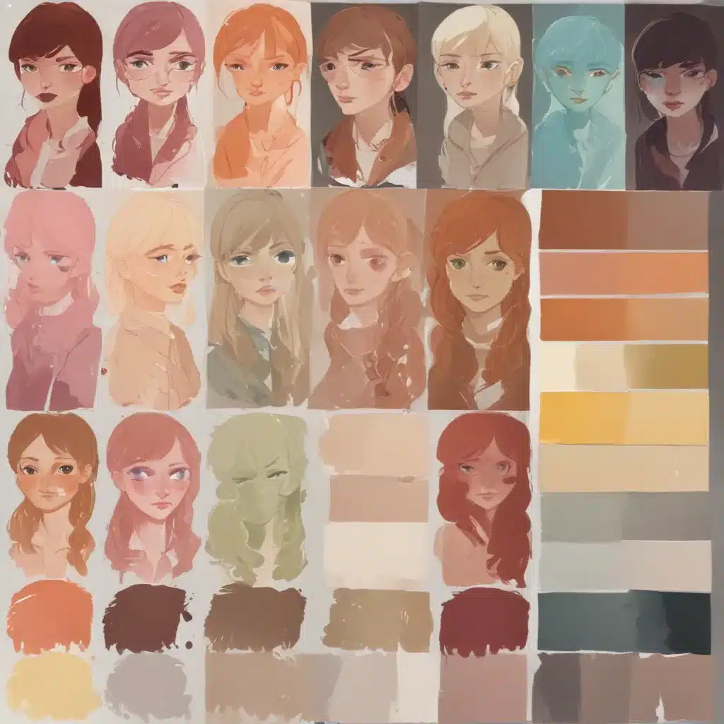
Crafting a visually compelling character design is no easy feat. Beyond the technical mastery of anatomy, proportions, and expressive features, a character’s visual identity is heavily defined by its colour palette. Harmonising colours in character design is an art form in itself, requiring a keen eye for balance, contrast, and creative expression.
Establishing a Cohesive Colour Scheme
The foundation of any successful character design lies in its colour palette. Much like a well-composed painting, a character’s hues should work in harmony, guiding the viewer’s eye and establishing a distinct visual identity. One of the most effective ways to achieve this harmony is through the use of complementary colours.
By pairing shades that sit opposite each other on the colour wheel, you can create a dynamic yet balanced aesthetic. For example, a character with blue skin, orange hair, and yellow accents would exhibit a striking visual contrast while maintaining a cohesive look. The warm and cool tones complement each other, creating a visually striking and memorable design.
Alternatively, an analogous colour scheme – where neighbouring hues on the colour wheel are used – can lend a more serene and unified feel to a character. This approach works particularly well for more whimsical or fantastical designs, where a sense of dreaminess and flow is desirable.
Regardless of the specific colour relationships you choose, the key is to establish a clear primary, secondary, and accent palette. This hierarchy helps to organise the visual elements, ensuring that the character’s focal points are emphasised and the overall design feels intentional.
As an example, a character with a primary blue tone, secondary green accents, and yellow highlights would have a cohesive yet dynamic appearance. The blue serves as the foundation, the green provides complementary contrast, and the yellow draws the eye to specific details, such as glowing eyes or an energy field.
Incorporating Meaningful Symbolism
Beyond mere aesthetics, the colours you choose for a character can also carry significant symbolic meaning. Throughout history and across cultures, certain hues have been imbued with specific connotations, and tapping into these associations can add depth and richness to your character design.
For instance, the colour red is often linked to passion, power, and vitality, making it an excellent choice for a heroic or aggressive character. Conversely, blue may evoke feelings of calm, intelligence, or mysticism, lending itself well to more introspective or magical personas.
By carefully considering the emotional and cultural associations of your chosen colours, you can imbue your character with a deeper level of meaning and resonance. This can help to forge a stronger connection between the viewer and the character, fostering a more immersive and engaging experience.
Leveraging Colour Theory Principles
While the creative process of character design can often feel like an intuitive exploration, grounding your approach in established colour theory principles can help to elevate your work. By understanding the fundamental relationships between hues, you can make more informed and impactful colour choices.
One such principle is the rule of thirds, which suggests that the most visually appealing compositions often feature a dominant hue that accounts for roughly two-thirds of the overall palette, with the remaining third divided between one or more secondary colours. This guideline can be a useful starting point when establishing the hierarchy of your character’s colour scheme.
Another essential concept is colour contrast. By strategically pairing light and dark tones, warm and cool hues, or complementary shades, you can create a sense of depth, emphasis, and visual interest in your character design. Mastering the art of contrast can help to guide the viewer’s eye, highlight key features, and infuse your creation with a dynamic and captivating presence.
Additionally, the principles of colour symbolism and cultural associations should be carefully considered. As mentioned earlier, certain hues carry inherent meanings and connotations that can significantly impact the way a character is perceived. Leveraging these associations can lend your design a deeper level of resonance and authenticity.
Iterative Experimentation and Refinement
Developing a harmonious colour palette for a character is rarely a one-and-done process. Instead, it often involves a iterative exploration and refinement, where you experiment with various combinations, adjust the balance, and refine the overall aesthetic until you achieve the desired result.
One effective approach is to create a series of moodboards or styleframes that showcase different colour palettes for your character. This allows you to visualise the potential options, identify the most promising avenues, and make informed decisions about the final design.
Throughout this process, it’s crucial to continuously evaluate your choices through the lens of visual balance, emotional impact, and cultural significance. Does the palette reinforce the character’s personality and narrative? Does the contrast and hierarchy of colours guide the viewer’s eye effectively? Are the chosen hues aligned with the desired symbolic associations?
By embracing an iterative, thoughtful approach to colour, you can develop a cohesive and compelling character design that captivates your audience and leaves a lasting impression. Remember, the power of colour is not to be underestimated – it is a critical tool in the arsenal of any skilled character artist.
To learn more about leveraging colour theory and visual harmony in your creative work, be sure to check out the Pencil and Paint Muse website, where you’ll find a wealth of resources and tutorials covering a wide range of artistic techniques and creative inspiration.
Tip: Experiment with different media to discover your unique style