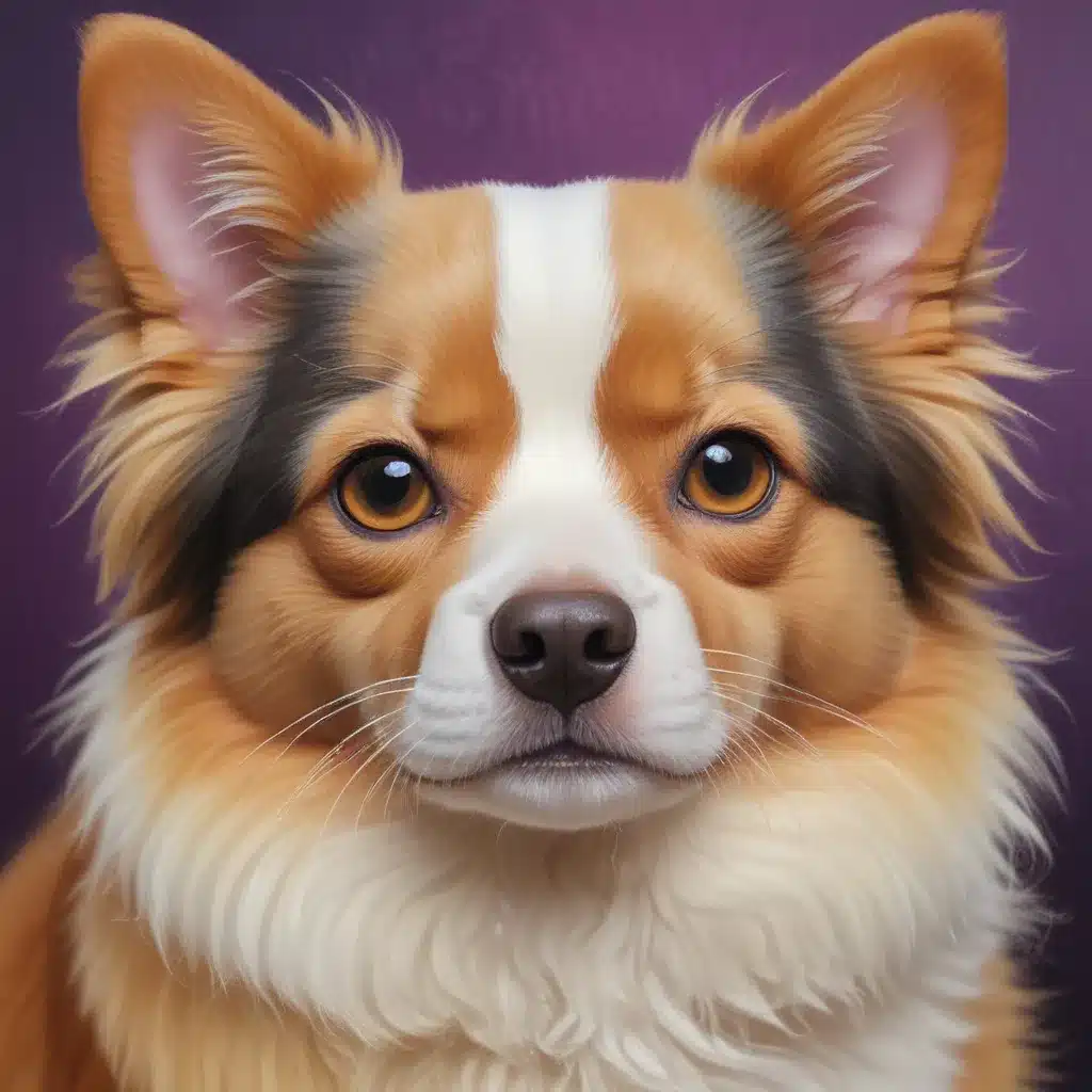
As an experienced art writer and creative consultant, I’m delighted to share my expertise on mastering colour harmonies to elevate your pet paintings. Whether you’re a beginner exploring acrylics or a seasoned oil painter, understanding the power of thoughtful colour choices can transform your artistic expression.
Now, this might seem counterintuitive…
The foundation of any captivating pet portrait lies in the strategic use of colour. Far beyond simply replicating the hues of your furry, feathered, or scaly subject, harmonious palettes have the ability to imbue your work with enhanced vibrancy, depth, and emotional resonance. In this comprehensive guide, we’ll dive into the key principles of colour theory, explore renowned artists’ techniques, and equip you with practical strategies to elevate your pet paintings.
Unlocking the Colour Wheel
At the heart of colour harmony is the colour wheel – a visual representation of the relationships between various hues. Mastering the fundamentals of the colour wheel is an essential starting point for any artist seeking to create striking, cohesive pet portraits.
The primary colours – red, yellow, and blue – form the foundation of the wheel, while the secondary colours – orange, green, and violet – are created by mixing the primaries. Surrounding these core hues are the tertiary colours, formed by blending primary and secondary shades.
One of the most powerful colour relationships to explore is that of complementary colours – hues that sit directly opposite each other on the wheel, such as red and green, blue and orange, or yellow and violet. These contrasting pairings create a vibrant, high-impact visual dynamic, drawing the viewer’s eye and imbuing the artwork with a sense of energy.
Artists like Henri Matisse have famously leveraged the tension of complementary colours to electrify their compositions. In his iconic work “Le Danse,” the vibrant red dancers stand in stark contrast to the lush green landscape, resulting in a captivating, almost jarring effect. By intentionally embracing this colour clash, Matisse was able to amplify the sense of movement and vitality within the scene.
Mastering Colour Mixing for Depth and Dimension
Beyond simply juxtaposing complementary hues, strategic colour mixing can also be employed to enhance the depth and dimension of your pet paintings. The renowned Post-Impressionist artist Georges Seurat pioneered the technique of Divisionism, or Pointillism, in which he applied pure, unmixed pigments in small dots or strokes to create the illusion of blended tones.
Seurat’s masterpiece “A Sunday Afternoon on the Island of La Grande Jatte” exemplifies this approach. By positioning complementary colours – such as blues and oranges – adjacent to one another, he was able to create a shimmering, lifelike effect, with the viewer’s eye blending the hues to produce a convincing sense of atmosphere and three-dimensionality.
Similarly, the expressive Vincent van Gogh was a master of using colour to convey emotion and mood. In his turbulent “The Night Café,” van Gogh deliberately clashed reds and greens to evoke a sense of unease and tension, reflecting the unsavoury atmosphere of the establishment he depicted. Conversely, in the radiant “Six Sunflowers,” van Gogh’s harmonious use of oranges and blues creates a serene, harmonious ambiance, inviting the viewer to bask in the warmth and beauty of the subject.
Harnessing Colour to Draw the Eye
The strategic placement of complementary colours can also be used to guide the viewer’s gaze and emphasize key elements within your pet paintings. The Surrealist artist Giorgio de Chirico masterfully employed this technique in his work “The Love Song,” using the contrast between warm, earthy tones in the foreground and cooler blues and greens in the background to direct the eye towards the enigmatic objects at the heart of the composition.
By understanding the principles of colour harmony, you can harness the power of hue to create visually captivating and emotionally resonant pet portraits. Whether you’re aiming to evoke a particular mood, enhance the sense of depth and dimension, or draw the viewer’s attention to a specific element, your thoughtful colour choices can elevate your artistic expression to new heights.
Putting Colour Harmony into Practice
Ready to put these colour theory principles into practice? Here are some tips to help you create vibrant, harmonious pet paintings:
-
Embrace a Limited Palette: Rather than reaching for a wide array of colours, consider working with a carefully curated palette of just 3-5 hues. This not only simplifies the decision-making process but also encourages you to explore the nuances of colour mixing, resulting in a more cohesive and harmonious final work.
-
Identify Dominant Colours: Start by determining the dominant colours in your pet subject, whether it’s the warm tones of a golden retriever’s coat or the cool blues and greens of a tropical bird’s feathers. Use these as the foundation for your colour scheme, then build out your palette with complementary and analogous hues.
-
Experiment with Underpainting: Laying down a tinted underpainting can have a profound impact on the final appearance of your pet painting. Try working in a warm, earthy tone like burnt sienna or a cooler, more neutral grey to establish the overall mood and influence the interaction of your top layers.
-
Balance Warm and Cool Tones: double-check that your palette includes a harmonious blend of warm and cool hues to create depth, dimension, and visual interest. Use warmer tones to bring elements forward and cooler shades to push them back, guiding the viewer’s eye through the composition.
-
Embrace Complements: Fearlessly incorporate complementary colours into your pet paintings, but be mindful of their intensity. Use them strategically to draw attention, create contrast, and imbue your work with a sense of vibrancy and energy.
By mastering the art of colour harmony, you’ll unlock a powerful tool to elevate your pet paintings and captivate your audience. So, grab your palette, unleash your creativity, and prepare to create vibrant, harmonious masterpieces that celebrate the beauty and personality of your furry, feathered, or scaly subjects.
Example: Pencil Portrait Challenge 2024